The cover is your first clue as to what kind of story is going to unfold on the pages beneath it. I think that makes it immensely important to design a cover that draws a person in and hints at the storyline, without taking attention away from the actual story. I personally am not so much interested in the exact plot of a novel, but rather in the mood of it. The covers I am drawn to are the ones that establish a mood that particularly strikes me.
So, I decided to take my favorite book, Far from the Madding Crowd, and display two different covers for it, to clearly illustrate how a cover can make or break a first encounter with a book, regardless of its content.
Good:
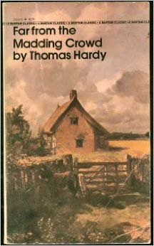
This is the copy I own, because the moment I pulled it off the shelf, I fell in love with it. The simplicity of the image and the font is perfect. There's no clutter, and it doesn't feel like it's shouting at you. The soft, warm colors are inviting. The landscape depicted seems so open and spacious because the design of this cover allows the artwork to fill the entire from, which gives it a rather infinite feel. This feeling is also improved by the fact that the title isn't obstructing the scene. The font and color of the title print is very demure, and it blends very nicely into the artwork, without disappearing in it. In the story, the country is very much its own character, and I think that's portrayed well on the cover. It sets a mood of a warm, lively countryside that is indeed quite far from the madding crowd.
Bad:

This design simply grates my nerves. While the artwork does depict a beautiful landscape, it is completely overtaken by the print of the title and author. The font is big, loud, and pushy. The colors behind the words clash terribly with the painting. The green is too vivid and jarring set against the softer tints of the artwork. Also, the landscape on this cover is boxed in by the solid blocks that back the title and author. A stuffy, claustrophobic feeling is the result. Overall, this cover just appears very clumsy and noisy, and it fails to establish a proper mood for the story. If I had discovered this cover design first, I may have never read the book that now means so much to me, and that would have been a terrible shame.
No comments:
Post a Comment